Statistical Data Analysis
In the following article, we will be learning about Statistical Data Analysis as per the syllabus prescribed for Secondary 4 Mathematics grade. We will study about:
- Introduction to Cumulative Frequency
- Median
- Upper and Lower Quartiles
- Interquartile Range (IQR)
- Range
- Percentile
Cumulative Frequency Table
To understand this concept, let us go through the following example.
Question 1:
The frequency table shows the height of 30 plants.
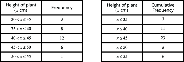
Based on the table,
- How many plants have a height of 35 cm or less?
- How many plants have a height of 40 cm or less?
- How many plants have a height of 45 cm or less?
Using these values, fill in the cumulative frequency table.
What do we notice about the value?
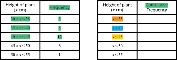
- There are 3 plants that are less than 35 cm or less.
- There are 11 plants that are less than 40 cm or less.
- There are 23 plants that are less than 45 cm or less.
So, cumulative frequency refers to the adding of all the previous frequencies.
To find the cumulative frequency of \(x\), we add up the frequencies that are less than or equal to \(x\).
The frequency table below shows the height of 30 plants.

Find the value of \(a\) and \(b\).
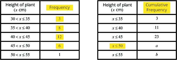
The value of \(a\) will be the total of heights of plants that are less than \(50 \;cm\), as highlighted in yellow. This indicates that we will add up all the values less than \(50 \;cm\). So,
\(3 + 8 + 12 + 16 = 29\)
Therefore, the value of \(a\) is 29.
The value of \(b\) will be the total of heights of plants that are less than \(55 \;cm\). This indicates that we will add up all the values less than \(55\). So,
\(\begin{align} b &= 3 + 8 + 12 + 6 + 1\\[2ex] &=30 \end{align} \)
Therefore, the value of \(b\) is \(30\).
Note: The last frequency is always equal to the total frequency.
Cumulative Frequency Graphs
The cumulative frequency table shows the height of \(30\) plants.
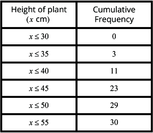
Using the horizontal scale of \(2 \;cm\) to represent \(5 \;centimetres\) and a vertical scale of \(1 \;cm\) to represent \(2 \;plants\), draw a smooth cumulative frequency curve to represent the distribution.
Solution:
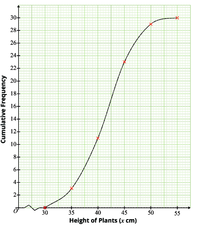
The vertical axis in the graph represents the cumulative frequency. The horizontal axis in the graph represents the height of the plants. The connected dots in the graph represent the cumulative frequency curve.
The cumulative frequency curve will always have a ‘S’ shape.
To summarise:
To draw a cumulative frequency curve,
Step 1:
Construct a cumulative frequency table to represent the data.
Step 2:
Plot the cumulative frequency.
Step 3:
Join the points with a smooth curve.
Question 2:
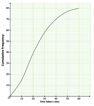
The cumulative frequency curve shows the time taken by 80 students to solve a Mathematics problem.
Use the graph to
- Complete the cumulative frequency table below.
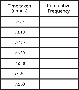
Solution:
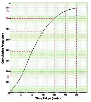
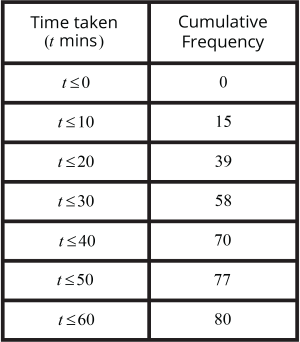
- The number of students who took 35 minutes or less to solve the problem.
Solution:
We plotted 35 minutes on the horizontal axis and the corresponding number of students, 65, on the vertical axis. Here, the cumulative frequency represents the number of children.
So, there were 65 students who took 35 minutes or less to solve the problem.
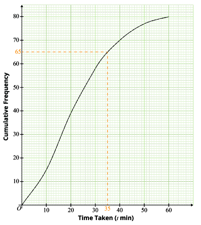
- The percentage of students who took more than 18 minutes to solve the problem.
Solution:
To find out the number of students who took more than \(18 \text{ minutes}\), we plot \(34\) on the cumulative frequency graph and move rightwards.
The total number of students who took more than \(80 \text{ minutes}\) are:
\(80 - 34 = 46\) students.
The percentage of students who took more than \(18 \text{ minutes}\) is:
\(\begin{align} \frac{46}{80} \times 100 = 57\frac{1}{2}\% \end{align}\)
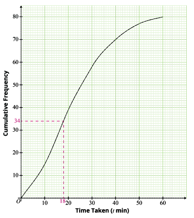
- The number of students who took more than \(13 \text{ minutes}\) but less than \(45 \text{ minutes}\) to solve the problem.
Solution:
We plot 13 on the horizontal axis and get the corresponding number of students on the vertical axis, that is 22.
We plot 45 on the horizontal axis and get 74 students on the vertical axis.
So, the total number of students who took more than 13 minutes but less than 45 minutes are:
\(74 - 22 = 52 \) students
Question 3:
The cumulative frequency curve shows the ages of 150 participants from a singing contest.
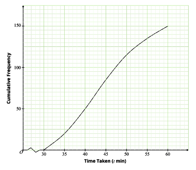
Use the graph to find
- The value of \(s\), given that 50 participants are of age \(s\) years or less.
- The value of \(t\), are of \(t\) years or less.
Solution:
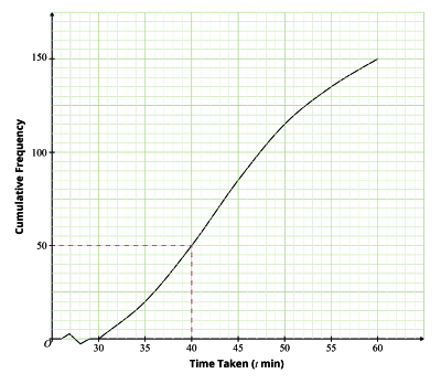
Participants are represented on the vertical axis. Age is represented on the horizontal axis. 50 participants are marked on the vertical axis and the corresponding age, 40 is marked on the horizontal axis.
So, \(s = 40\) years
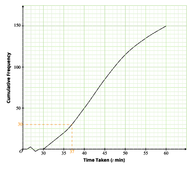
Total number of participants is 15. So, 20% of the participants:
\(\begin{align} \frac{20}{100} \times 150 = 30 \end{align}\) participants.
So, we will plot 30 participants on vertical axis and corresponding age on horizontal axis.
So, \(t=37\) years
Median, Quartiles, Interquartile Range and Range
Median is the value of the data in the middle position, when arranged in ascending order.
Lower Quartile \(=\) middle value in the set of values in the lower half.
Upper Quartile \(=\) middle value in the set of values in the upper half.
Interquartile Range \(=\) Upper quartile \(-\) Lower quartile.
Range \(=\) Highest Value \(-\) Lowest Value.
Interquartile Range and Range are used to measure the spread of a data set. In general, a higher Interquartile Range signifies a lower consistency in the data set. A lower Interquartile Range signifies a higher consistency in the data set.
Question 4:
A set of data is given.
\(12, 8, 3, 7, 1, 16, 4, 10, 15, 2, 17\)
Find the
- Median
- Lower Quartile
- Upper Quartile
- Interquartile Range
- Range
Solution:
- Arranging the data set in ascending order:
\(1, 2, 3, 4, 7, 8, 10, 12, 15, 16, 17\)
The median is: \(8\)
- Lower Quartile : \(3\)
- Upper Quartile : \(15\)
- \(\begin{align}\\[2ex] \text{Interquartile Range} &: \text{Upper Quartile} - \text{Lower Quartile}\\[2ex] &: 15 - 3 = 12 \end{align} \)
- \(\begin{align}\\[2ex] \text{Range} &: \text{Highest Value} - \text{Lower Value}\\[2ex] &: 17 - 1 = 16 \end{align} \)
Conclusion
In this article, we learnt cumulative frequency, cumulative frequency table and cumulative frequency curves as per the syllabus of Secondary 4 Mathematics class. We also studied median, lower quartile, upper quartile, interquartile range and range.
| Continue Learning | |
|---|---|
| Sets: Venn Diagrams, Intersections & Union | Probability of Combined Events |
| Statistical Data Analysis | Matrices |
| Vectors | |